

Design Portfolio
Brand Redesign


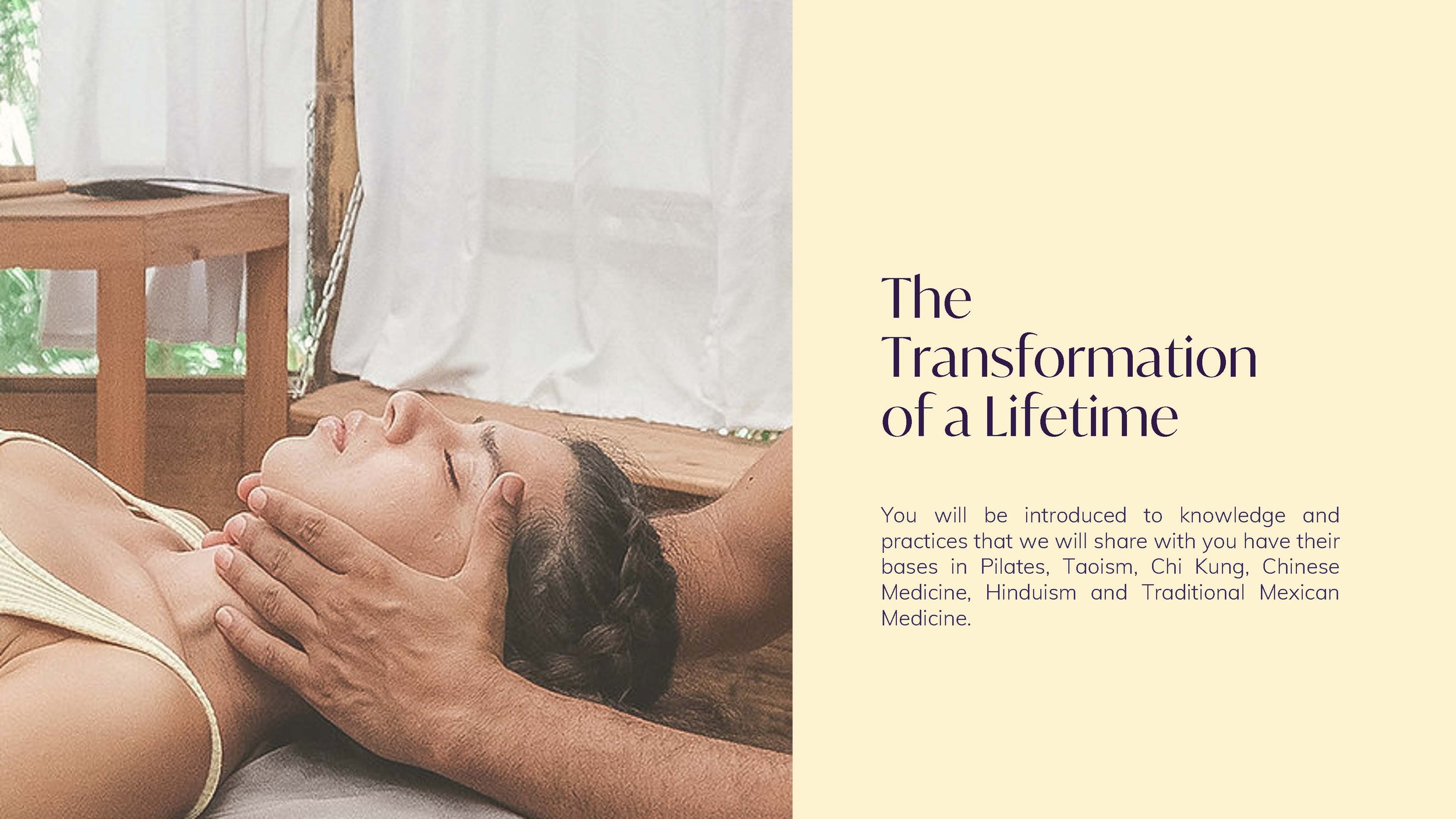
Yayasphere is a pilates and wellness brand advocating the notion that “movement is medicine,” via accessibility and education.
Yayasphere asked me to refresh the visual identity and website design to modernize outreach. It is essential that Yayasphere have a brand system that caters to the expansion of its three pillars: mind, spirit, and body.
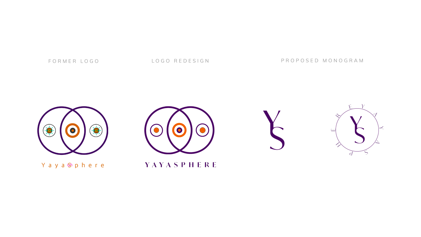

Logo Redesign
I kept the initial logo frame and focused on enhancing the brand identity by introducing a simplified and elegant color scheme, typeface, and monogram.
Brand Refresh
Yayasphere needed an identity refresh in order to compete withing the digital wellness and fitness world.
I evolved a brand identity that translated the ideals that make up Yayasphere: a love for life, health being the only wealth, and inclusivity of every kind of body.
The goal was to create content full of vibrant tropical colors encompassing the Puerto Rican heritage behind the word Yaya and founder herself.


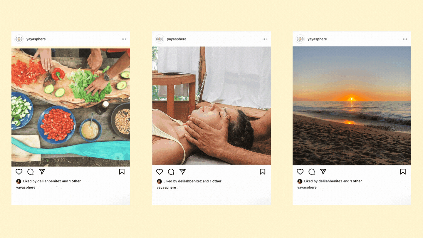
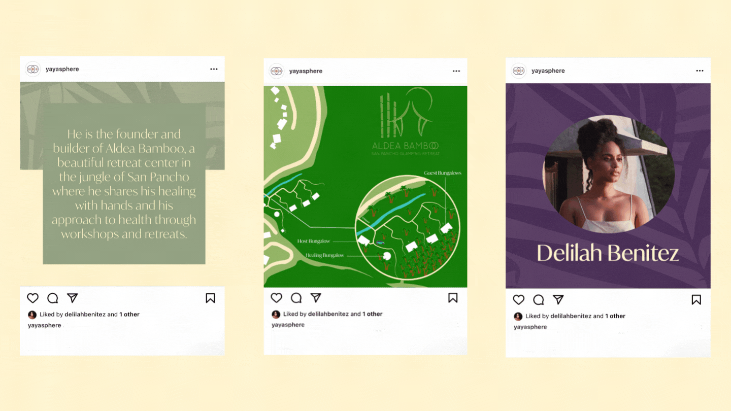
Collaboration Campaign
The campaign is designed to incorporates the scenic landscape of the retreat with storytelling to convey the experience.
Digital Transformation
I designed a simplified digital experience for Yayasphere. The website now hosts all three brand tiers.


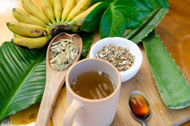
Content Photography


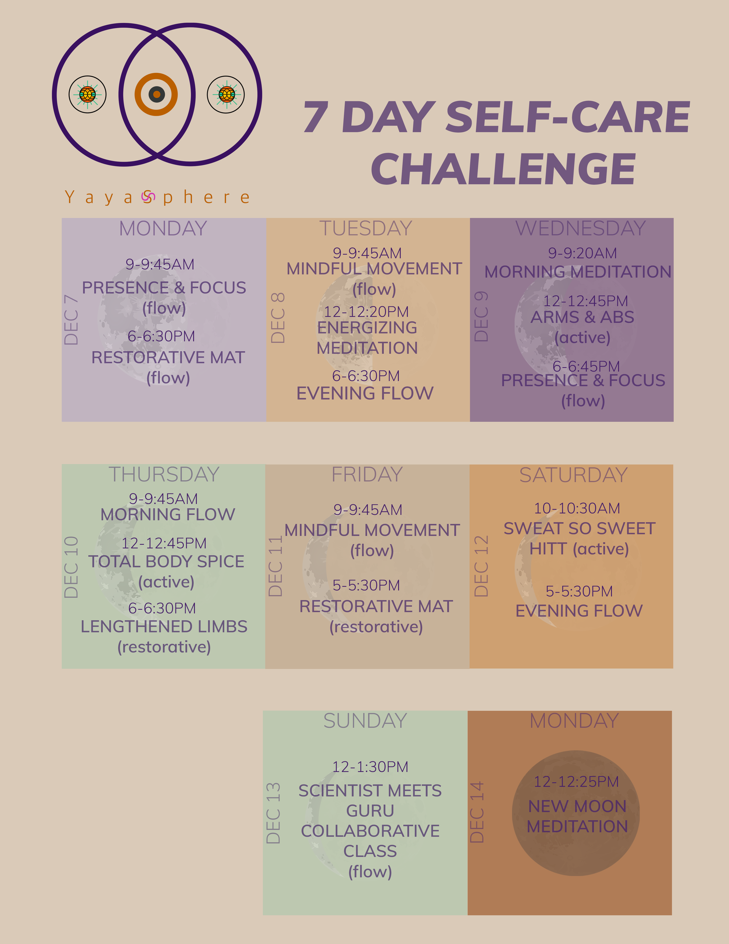
7 Days of Self Care Program (2020)

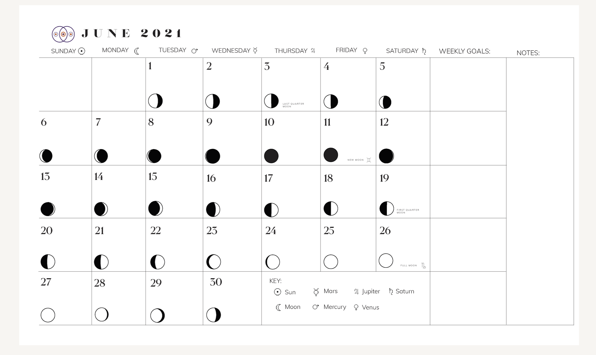
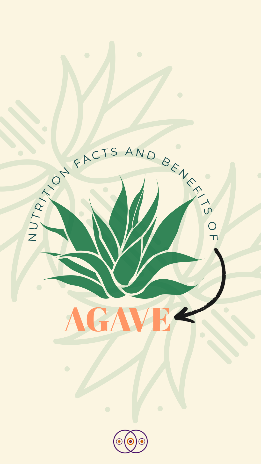
Additional Graphics


Cache


Logos


Logo Refresh
The updated logo refines the sophisticated, and adaptive nature of Sounds Music Group. Reflecting its illustrious origin story and beckoning its evolution into the future of the music industry.
New Chapter
I redesigned a logo that reflects the essence of Cobey’s Sweet Treats. Incorporating a lively color palette that invites the consumer in with the same warmth and boldness found in each dessert.


Brand Identity
I kept the initial logo frame and focused on enhancing the brand identity by introducing a simplified and elegant color scheme, typeface, and monogram.
Cover Art

What To Do by Danny Towers (2020)

Party Girl by StaySolidRocky (2020)

Rainbows by Briana Hues' (2020)

Pieces by Anthony Flammia (2019)


The Process
The What To Do cover was inspired by a vintage astrological book from the 70s. I used the typographical style and color palette of the book to reflect and capture the aura of the song’s nostalgic style. Pulling details from the artist’s past covers to translate the significance of artistic evolution.
Idea Actualization
I had the opportunity of creating the cover art for this single. The artist’s idea called for a simplified direction incorporating ideas from a previously released home video for the song. I refreshed the existing idea with an authentic color palette and bold typography.
